Bootstrap是美国Twitter公司的设计师Mark Otto和Jacob Thornton合作基于HTML、CSS、JavaScript 开发的简洁、直观、强悍的前端开发框架,使得 Web 开发更加快捷。Bootstrap提供了优雅的HTML和CSS规范,它即是由动态CSS语言Less写成。Bootstrap一经推出后颇受欢迎,一直是GitHub上的热门开源项目,包括NASA的MSNBC(微软全国广播公司)的Breaking News都使用了该项目。 [1] 国内一些移动开发者较为熟悉的框架,如WeX5前端开源框架等,也是基于Bootstrap源码进行性能优化而来。 [2]
目前使用较广的是版本2、3和4,其中2的最新版本的是2.3.2,3的最新版本是3.4.1,在2018年1月下旬,Bootstrap团队发布了Bootstrap 4 正式版,4的最主要变化包括以下方面:
- 从 Less 迁移到 Sass
- 改进网格系统
- 缺省弹性框支持
- Dropped wells, thumbnails, and panels for cards
- 合并所有 HTML resets 到一个新的模块中:Reboot
- 全新自定义选项
- 不再支持 IE8
- 重写所有的 JavaScript 插件
- 改进工具提示和 popovers 的自动定位
- 改进文档
- 其他大量改进 [4]
bootstrap3最低兼容IE6,在国内环境下,虽然bootstrap5也已经推出,但v3版本使用范围比较大,且v3版本的中文文档比较完善。
快速上手
bootstrap是响应式框架,准确的说是“移动优先”。
第一个bootstrap文档
bootstrap3依赖于jquery,首先它必须引入jquery,然后再引入bootstrap.js。另外bootstrap也有一个css样式,综合下来至少需要引入3个文件。
下面是一个最简单的bootstrap文档。
<!DOCTYPE html>
<html lang="zh-CN">
<head>
    <meta charset="UTF-8">
    <meta http-equiv="X-UA-Compatible" content="IE=edge">
    <meta name="viewport" content="width=device-width, initial-scale=1.0">
    <title>bootstrap 101</title>
    <link rel="stylesheet" href="https://www.52dixiaowo.com/tools/npm/bootstrap@3.4.1/dist/css/bootstrap.min.css">
    <script src="https://www.52dixiaowo.com/tools/npm/jquery@1.12.4/dist/jquery.min.js"></script>
    <script src="https://www.52dixiaowo.com/tools/npm/bootstrap@3.4.1/dist/js/bootstrap.min.js"></script>
</head>
<body>
    <h1>Hello,Bootstrap3!</h1>
</body>
</html>
需要注意的是,如果需要响应式必须添加meta标签指定viewport。此外,由于jquery应该在bootstrap.min.js之前,否则使用时可能报错。
下载与安装
推荐使用npm快速下载:
cnpm install bootstrap@3此外,你可以从bootstrap官网(getbootstrap.com)下载,该网站使用国内网络也可以正常访问。
国内的bootstrap中文网比较多,比如:Bootstrap中文网 (bootcss.com)
全局CSS样式
深入了解 Bootstrap 底层结构的关键部分,包括我们让 web 开发变得更好、更快、更强壮的最佳实践。
需要 HTML5 文档类型
Bootstrap 使用某些需要使用 HTML5 文档类型的 HTML 元素和 CSS 属性。将它包含在所有项目的开头。
<!DOCTYPE html>
<html lang="zh-CN">
  ...
</html>
排版和链接
Bootstrap 设置基本的全局显示、排版和链接样式。具体来说,我们:
- 删除主体上的边距
- 为
body元素设置background-color: white; - 使用
@font-family-base、@font-size-base和@line-height-base变量作为排版的基本参数 - 为所有链接设置了基本颜色
@link-color,并且当链接处于:hover状态时才添加下划线
这些样式都能在 scaffolding.less 文件中找到对应的源码。
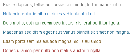
情境文本色
通过颜色来展示意图,Bootstrap 提供了一组工具类。这些类可以应用于链接,并且在鼠标经过时颜色可以还可以加深,就像默认的链接一样。
文本颜色,主要用于p、span、button、等展示文字上,主要表示color属性。
- .text-muted:提示,使用浅灰色(#999)
- .text-primary:主要,使用蓝色(#428bca)
- .text-success:成功,使用浅绿色(#3c763d)
- .text-info:通知,使用浅蓝色(#31708f)
- .text-warning:警告,使用黄色(#8a6d3b)
- .text-danger:危险,使用褐色(#a94442)
<p class="text-muted">Fusce dapibus, tellus ac cursus commodo, tortor mauris nibh.</p>
<p class="text-primary">Nullam id dolor id nibh ultricies vehicula ut id elit.</p>
<p class="text-success">Duis mollis, est non commodo luctus, nisi erat porttitor ligula.</p>
<p class="text-info">Maecenas sed diam eget risus varius blandit sit amet non magna.</p>
<p class="text-warning">Etiam porta sem malesuada magna mollis euismod.</p>
<p class="text-danger">Donec ullamcorper nulla non metus auctor fringilla.</p>
实现效果如下:
情境背景色
和情境文本颜色类一样,使用任意情境背景色类就可以设置元素的背景。链接组件在鼠标经过时颜色会加深,就像上面所讲的情境文本颜色类一样。
- .bg-primary:主要的,蓝色,#337ab7
- .bg-success:成功,浅绿色,#dff0d8
- .bg-info:提示,浅蓝色,#d9edf
- .bg-warning:警告,浅黄,#fcf8e3
- .bg-danger:危险,浅红,#f2dede
<p class="bg-primary">Nullam id dolor id nibh ultricies vehicula ut id elit.</p>
<p class="bg-success">Duis mollis, est non commodo luctus, nisi erat porttitor ligula.</p>
<p class="bg-info">Maecenas sed diam eget risus varius blandit sit amet non magna.</p>
<p class="bg-warning">Etiam porta sem malesuada magna mollis euismod.</p>
<p class="bg-danger">Donec ullamcorper nulla non metus auctor fringilla.</p>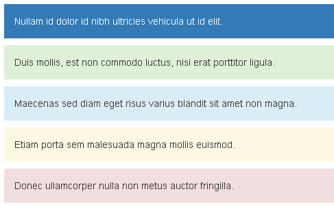
注释:没有.bg-muted(灰色)类
栅格系统
栅格系统英文为“grid systems”,也有人翻译为“网格系统”,运用固定的格子设计版面布局,其风格工整简洁,在二战后大受欢迎,已成为今日出版物设计的主流风格之一,bootstrap从v3版本内置了栅格系统。
布局容器
Bootstrap 需要为页面内容和栅格系统包裹一个 .container 容器。我们提供了两个作此用处的类。注意,由于 padding 等属性的原因,这两种 容器类不能互相嵌套。
.container 类用于固定宽度并支持响应式布局的容器。
<div class="container">
  ...
</div>
.container-fluid 类用于 100% 宽度,占据全部视口(viewport)的容器。
<div class="container-fluid">
  ...
</div>
工作原理
默认的 Bootstrap 网格系统使用 12 列,随着屏幕或视口(viewport)尺寸的缩放,进而改变排版内容。在栅格系统中,我们在 Less 文件中使用以下媒体查询(media query)来创建关键的分界点阈值。
/* 超小屏幕(手机,小于 768px) */
/* 没有任何媒体查询相关的代码,因为这在 Bootstrap 中是默认的(还记得 Bootstrap 是移动设备优先的吗?) */

/* 小屏幕(平板,大于等于 768px) */
@media (min-width: @screen-sm-min) { ... }

/* 中等屏幕(桌面显示器,大于等于 992px) */
@media (min-width: @screen-md-min) { ... }

/* 大屏幕(大桌面显示器,大于等于 1200px) */
@media (min-width: @screen-lg-min) { ... }
我们偶尔也会在媒体查询代码中包含 max-width 从而将 CSS 的影响限制在更小范围的屏幕大小之内。
@media (max-width: @screen-xs-max) { ... }
@media (min-width: @screen-sm-min) and (max-width: @screen-sm-max) { ... }
@media (min-width: @screen-md-min) and (max-width: @screen-md-max) { ... }
@media (min-width: @screen-lg-min) { ... }
基本使用
- “行(row)”必须包含在
.container(固定宽度)或.container-fluid(100% 宽度)中,以便为其赋予合适的排列(aligment)和内补(padding)。 - 通过“行(row)”在水平方向创建一组“列(column)”。
- 你的内容应当放置于“列(column)”内,并且,只有“列(column)”可以作为行(row)”的直接子元素。
- 栅格系统中的列是通过指定1到12的值来表示其跨越的范围。例如,三个等宽的列可以使用三个
.col-xs-4来创建。 - 如果一“行(row)”中包含了的“列(column)”大于 12,多余的“列(column)”所在的元素将被作为一个整体另起一行排列。
- 栅格类适用于与屏幕宽度大于或等于分界点大小的设备 , 并且针对小屏幕设备覆盖栅格类。 因此,在元素上应用任何
.col-md-*栅格类适用于与屏幕宽度大于或等于分界点大小的设备 , 并且针对小屏幕设备覆盖栅格类。 因此,在元素上应用任何.col-lg-*不存在, 也影响大屏幕设备。
通过下表可以详细查看 Bootstrap 的栅格系统是如何在多种屏幕设备上工作的。
| 超小屏幕 手机 (<768px) | 小屏幕 平板 (≥768px) | 中等屏幕 桌面显示器 (≥992px) | 大屏幕 大桌面显示器 (≥1200px) | |
|---|---|---|---|---|
| 栅格系统行为 | 总是水平排列 | 开始是堆叠在一起的,当大于这些阈值时将变为水平排列C | ||
.container 最大宽度 | None (自动) | 750px | 970px | 1170px |
| 类前缀 | .col-xs- | .col-sm- | .col-md- | .col-lg- |
| 列(column)数 | 12 | |||
| 最大列(column)宽 | 自动 | ~62px | ~81px | ~97px |
| 槽(gutter)宽 | 30px (每列左右均有 15px) | |||
| 可嵌套 | 是 | |||
| 偏移(Offsets) | 是 | |||
| 列排序 | 是 | |||
实际上,bootstrap是给块级元素增加class,以达到栅格布局的效果。例如以下代码:
<!DOCTYPE html>
<html lang="zh-CN">
<head>
    <meta charset="UTF-8">
    <meta http-equiv="X-UA-Compatible" content="IE=edge">
    <meta name="viewport" content="width=device-width, initial-scale=1.0">
    <title>栅格系统实例</title>
    <link rel="stylesheet" href="https://www.52dixiaowo.com/tools/npm/bootstrap@3.4.1/dist/css/bootstrap.min.css">
    <script src="https://www.52dixiaowo.com/tools/npm/jquery@1.12.4/dist/jquery.min.js"></script>
    <script src="https://www.52dixiaowo.com/tools/npm/bootstrap@3.4.1/dist/js/bootstrap.min.js"></script>
</head>
<body>
<div class="container">
    <!-- Stack the columns on mobile by making one full-width and the other half-width -->
    <!-- Stack the columns on mobile by making one full-width and the other half-width -->
    <div class="row">
        <div class="col-xs-12 col-md-8 bg-primary">.col-xs-12 .col-md-8</div>
        <div class="col-xs-6 col-md-4 bg-success">.col-xs-6 .col-md-4</div>
      </div>

      <!-- Columns start at 50% wide on mobile and bump up to 33.3% wide on desktop -->
      <div class="row">
        <div class="col-xs-6 col-md-4 bg-danger">.col-xs-6 .col-md-4</div>
        <div class="col-xs-6 col-md-4 bg-success">.col-xs-6 .col-md-4</div>
        <div class="col-xs-6 col-md-4 bg-primary">.col-xs-6 .col-md-4</div>
      </div>

      <!-- Columns are always 50% wide, on mobile and desktop -->
      <div class="row">
        <div class="col-xs-6 bg-success">.col-xs-6</div>
        <div class="col-xs-6 bg-warning">.col-xs-6</div>
      </div>
</div>
</body>
</html>
前面讲过,栅格系统或其他内容均需要包含在container或container-fluid容器内,接下来必须可以创建row作为行,然后col作为列是行的直接子元素。
运行并尝试缩放尺寸,我们发现,两个col-xs-6作为一行时,无论在手机、平板、PC下均把一行分为2半,而col-xs6和col-md4同时应用时,在手机端为1/2,而平板、PC下则为1/3。
由此,我们也验证了一点:移动优先。如果多个尺寸下的样式同时应用在一个元素上,寸尺小的设备先生效,如果有大尺寸样式应用则把小尺寸样式覆盖,如果没有覆盖则小尺寸样式在所有尺寸下均生效。
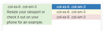
响应列重置
在某些阈值时,某些列可能会出现比别的列高的情况。为了克服这一问题,可以使用 .clearfix ,例如以下实例:
<!DOCTYPE html>
<html lang="zh-CN">
<head>
    <meta charset="UTF-8">
    <meta http-equiv="X-UA-Compatible" content="IE=edge">
    <meta name="viewport" content="width=device-width, initial-scale=1.0">
    <title>clearfix实例</title>
    <link rel="stylesheet" href="https://www.52dixiaowo.com/tools/npm/bootstrap@3.4.1/dist/css/bootstrap.min.css">
    <script src="https://www.52dixiaowo.com/tools/npm/jquery@1.12.4/dist/jquery.min.js"></script>
    <script src="https://www.52dixiaowo.com/tools/npm/bootstrap@3.4.1/dist/js/bootstrap.min.js"></script>
</head>
<body>
<div class="container">
    <div class="row">
        <div class="col-xs-6 col-sm-3 bg-success">
          .col-xs-6 .col-sm-3
          <br>
          Resize your viewport or check it out on your phone for an example.
        </div>
        <div class="col-xs-6 col-sm-3 bg-primary">.col-xs-6 .col-sm-3</div>

        <!-- Add the extra clearfix for only the required viewport -->
        <div class="clearfix visible-xs-block"></div>

        <div class="col-xs-6 col-sm-3 bg-warning">.col-xs-6 .col-sm-3</div>
        <div class="col-xs-6 col-sm-3 bg-danger">.col-xs-6 .col-sm-3</div>
      </div>
</div>
</body>
</html>
提示:上面的代码运行是预期正常的,请试着去掉clearfix,此时它在移动端排版将会错乱,错乱后如下图所示:
列排序
对于不同的设备,使用列排序可以轻松的改变列的顺序,比如PC的左、右两列在移动端展开后变为下、上两列:
<!DOCTYPE html>
<html lang="zh-CN">
<head>
    <meta charset="UTF-8">
    <meta http-equiv="X-UA-Compatible" content="IE=edge">
    <meta name="viewport" content="width=device-width, initial-scale=1.0">
    <title>列排序实例</title>
    <link rel="stylesheet" href="https://www.52dixiaowo.com/tools/npm/bootstrap@3.4.1/dist/css/bootstrap.min.css">
    <script src="https://www.52dixiaowo.com/tools/npm/jquery@1.12.4/dist/jquery.min.js"></script>
    <script src="https://www.52dixiaowo.com/tools/npm/bootstrap@3.4.1/dist/js/bootstrap.min.js"></script>
</head>
<body>
<div class="container">
  <div class="row">
    <div class="col-md-9 col-md-push-3 bg-danger">.col-md-9 .col-md-push-3</div>
    <div class="col-md-3 col-md-pull-9 bg-primary">.col-md-3 .col-md-pull-9</div>
  </div>
</div>
</body>
</html>
基本排版
这里介绍一些基本的bootstrap排版
字体大小
HTML 中的所有标题标签,<h1> 到 <h6> 均可使用。另外,还提供了 .h1 到 .h6 类,为的是给内联(inline)属性的文本赋予标题的样式。
Bootstrap 将全局 font-size 设置为 14px,line-height 设置为 1.428。这些属性直接赋予 <body> 元素和所有段落元素。另外,<p> (段落)元素还被设置了等于 1/2 行高(即 10px)的底部外边距(margin)。
除了可以使用h1~h6类快速设置文字大小。还可以
- 使用small类设置更小号字体
- 以及使用h标签嵌套small,快速得到标题和副标题样式
请尝试以下实例:
<!DOCTYPE html>
<html lang="zh-CN">
<head>
    <meta charset="UTF-8">
    <meta http-equiv="X-UA-Compatible" content="IE=edge">
    <meta name="viewport" content="width=device-width, initial-scale=1.0">
    <title>字体大小实例</title>
    <link rel="stylesheet" href="https://www.52dixiaowo.com/tools/npm/bootstrap@3.4.1/dist/css/bootstrap.min.css">
    <script src="https://www.52dixiaowo.com/tools/npm/jquery@1.12.4/dist/jquery.min.js"></script>
    <script src="https://www.52dixiaowo.com/tools/npm/bootstrap@3.4.1/dist/js/bootstrap.min.js"></script>
</head>
<body>
<div class="container">
  <p class="h1">h1样式</p>
  <p class="h2">h2样式</p>
  <p class="h3">h3样式</p>
  <p class="h4">h4样式</p>
  <p class="h5">h5样式</p>
  <p class="h6">h6样式</p>
  <p>默认的p样式</p>
  <p class="small">small样式</p>
  <h2>标题<small>副标题</small></h2>
</div>
</body>
</html>
waiting…
本篇完,还有疑问?留下评论吧